Spartan Camera
Redesigning a Technical E-commerce Storefront
Project Showcase Copyright © 2026
LAST UPDATED: Sep, 2026
AUTHOR: ⊹ Gabb ⊹
VERSION: 2.4
+++ Role +++
Lead Designer
I was responsible for UX research, competitor analysis, defining page structures.
Since there was no design system in palace at the time I decided to create one to help our marketing and development teams build and maintain the storefront in the future.
+++ Description +++
Spartan Camera is a hunting brand focused on selling cellular trail cameras with data plans that keep them connected to the internet.
Early on we noticed that a ton of key product details were either dificult to find, or just straight up missing. The data plans were a mess, and the entire storefront felt like it had been sitting since the early 2010's
The end goal was to modernize the storefront, make it easier to shop, and provide honest, easy=to=access information so customers didn't have to figure everything out themseves.
I'm highlighting a few parts of the redesign here, but if you'd rather see the work for yourself, feel free to open the full Figma project or design system below. :)
[ 01 ] Collection Pages.
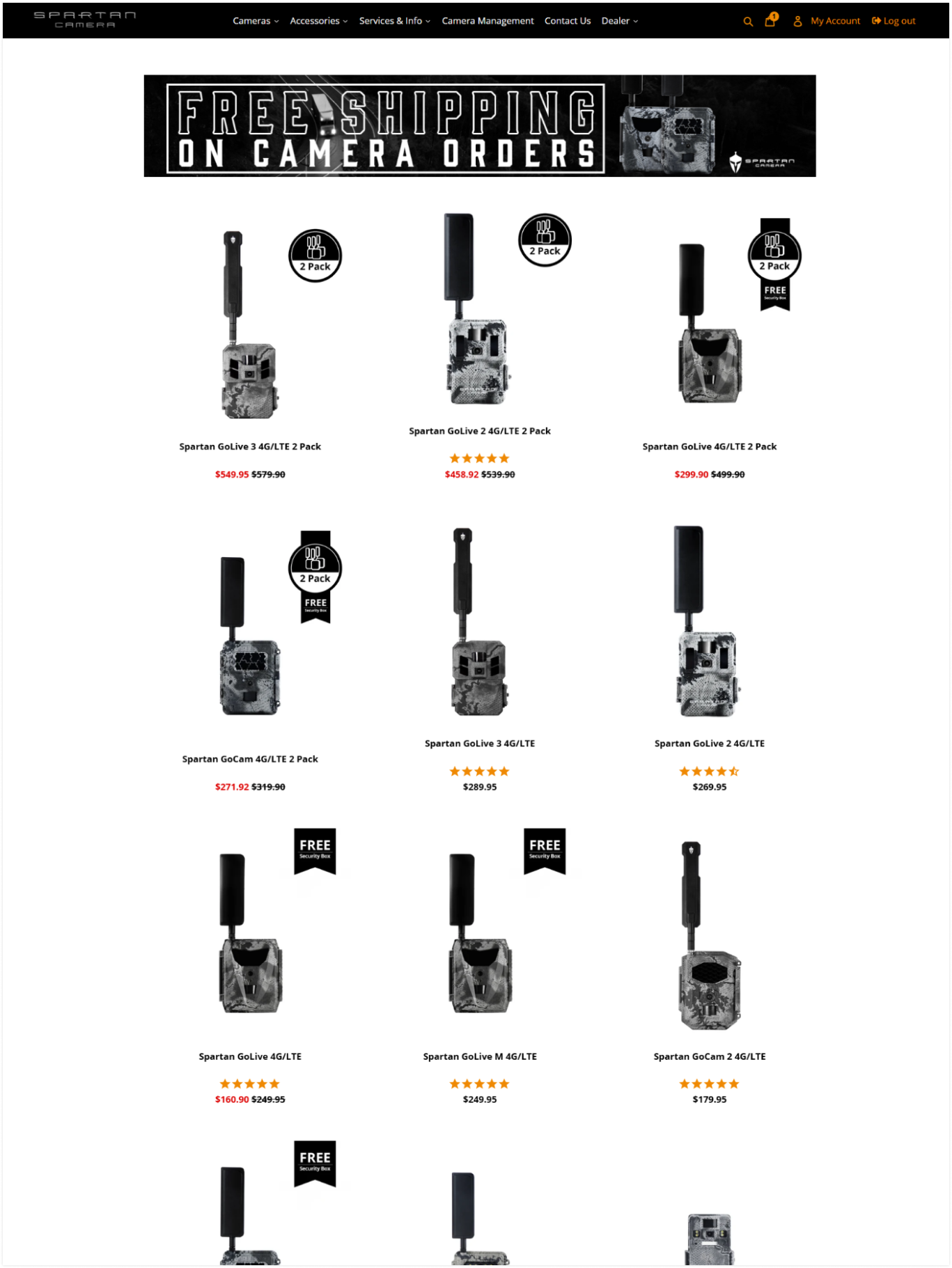
The original collection pages tried to show just about everything at once. Camera models, variants, carriers, bundles... all hanging out on the same page.
It made browsing the lineup much more tedious then it needed to be, especially for someone who didn't know which camera they wanted in the first place.
+++ Solutions +++
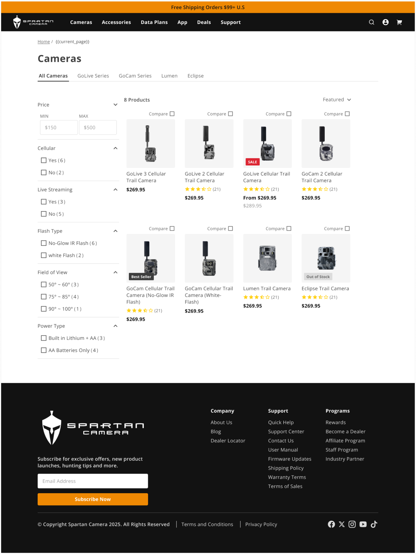
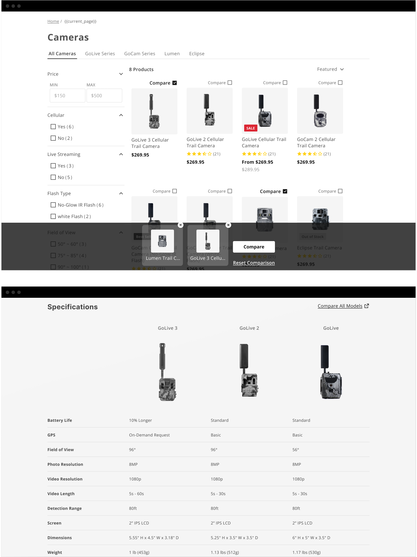
The redesign separated the collection by camera model and introduced filters commonly used in the trail camera industry, making it easier to narrow our lineup without having to dig through every product variation right from the start
A spec comparison module was also added for users who wanted to get a little more technical before making a decision.
Oh and we moved the bundles into their own collection for more experienced users who already knew what they wanted and were looking to buy in bulk. This helped keep the browsing experience focused for new customers without taking those options away from returning ones.
We ended up with an easier way to browse the lineup with less options that were all competing for the same ammount of attention.
[ 02 ] Product Pages.
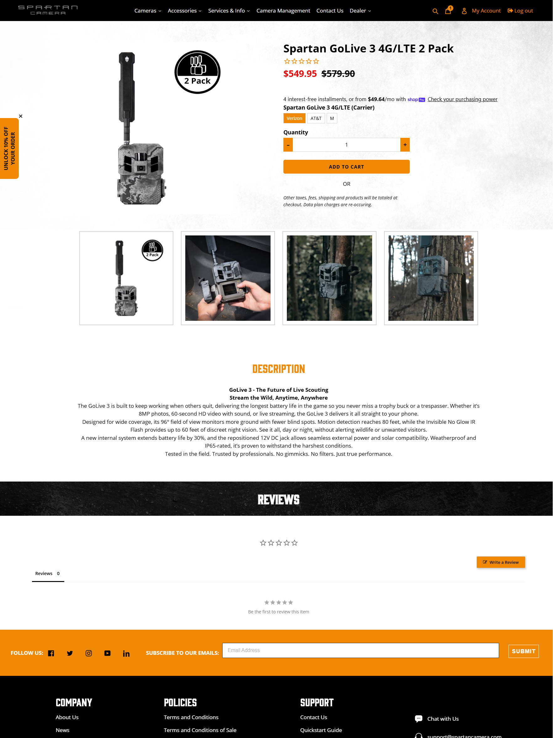
These pages were outdated as hell, but the biggest issue I had was the amount of technical information it left out.
Things like product manuals, feature breakdowns, accessories, and even a simple product spec were all hidden under an easy-to-miss description. Which is pretty important information a technical product should display, if you ask me.
+++ Solutions +++
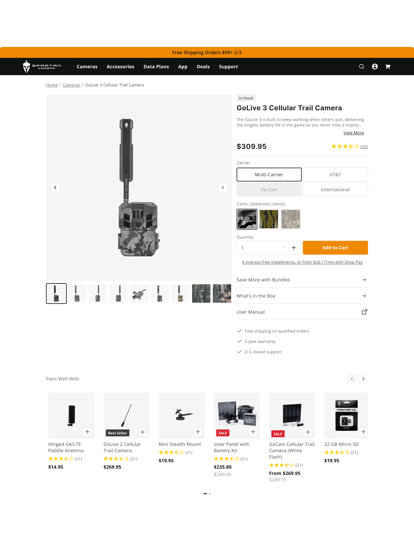
The redesign brought the relevant device information into one place. Users could access the product manual, view available bundles, and find compatible accessories without having to spend a whole frikin' season hunting for them.
Most importantly, we added a dedicated warning message for users who selected an international model, along with all the available bandwidths supported by the international variant. This was particularly important information since selecting the wrong model could mean buying a camera that wasn't compatible with the user's network.
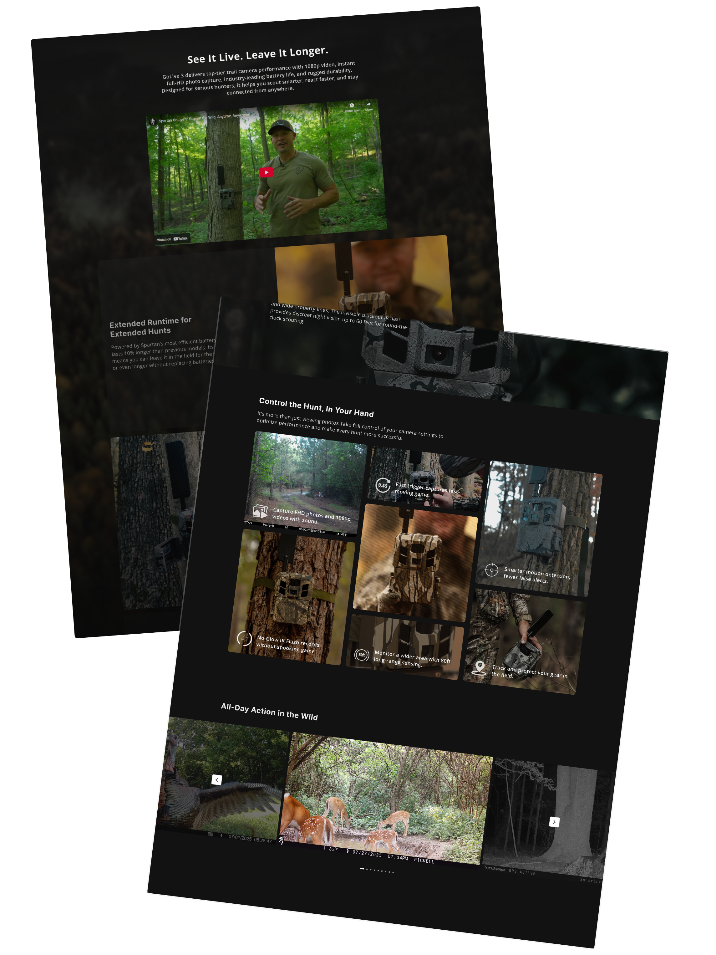
Feature highlights were also added to each product page to highlight the things that actually differentiate each camera, like photo quality, battery life, live streaming capabilities, and other model-specific features.
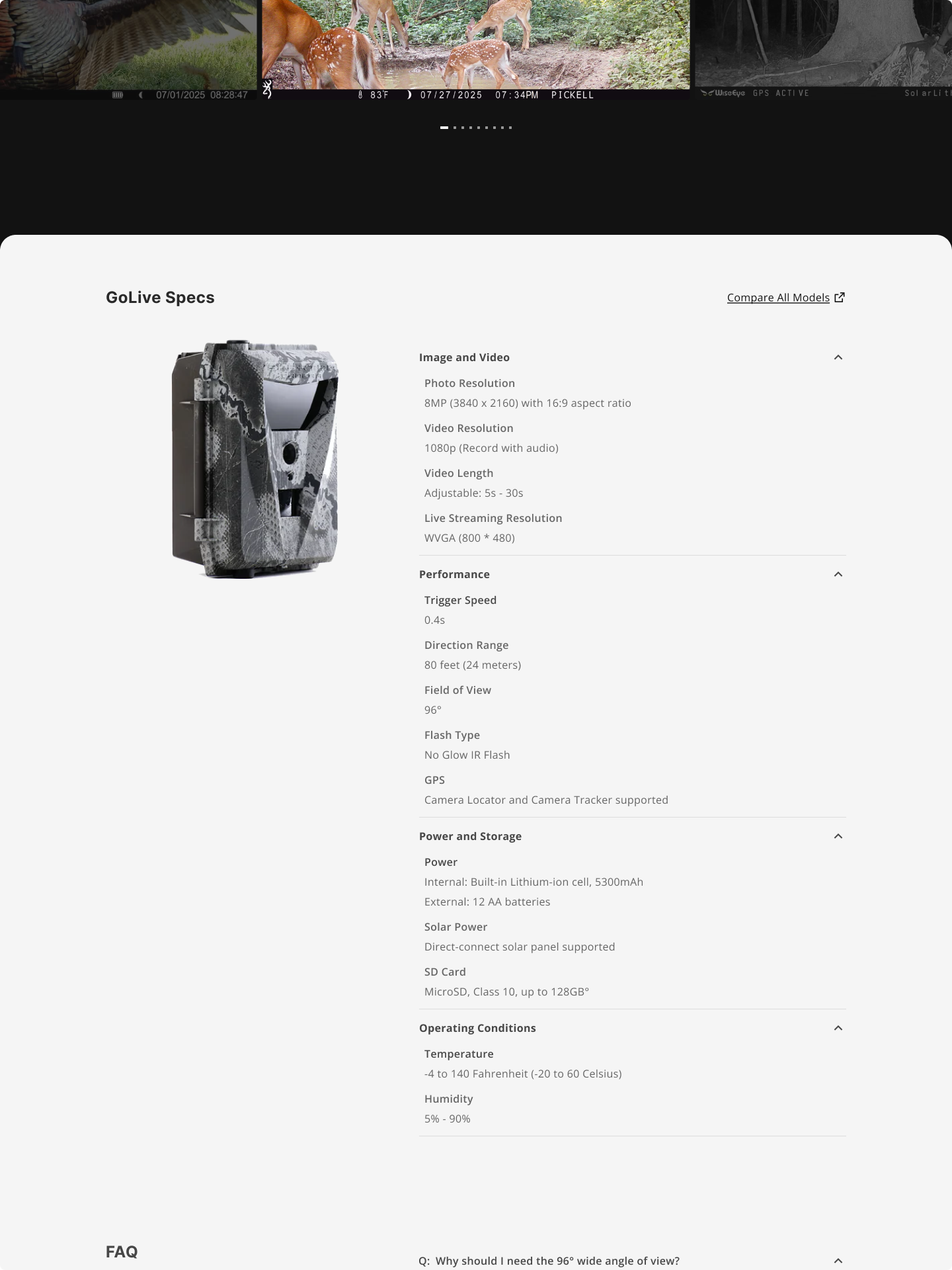
A spec table section was built to provide the technical details you'd expect from a modern hardware product.
...wild concept, I know.
+++ Impact +++
Overal the new PDPs gave customers a clearer picture of what they were actually buying before making it to chekcout.
[ 03 ] Data Plans.
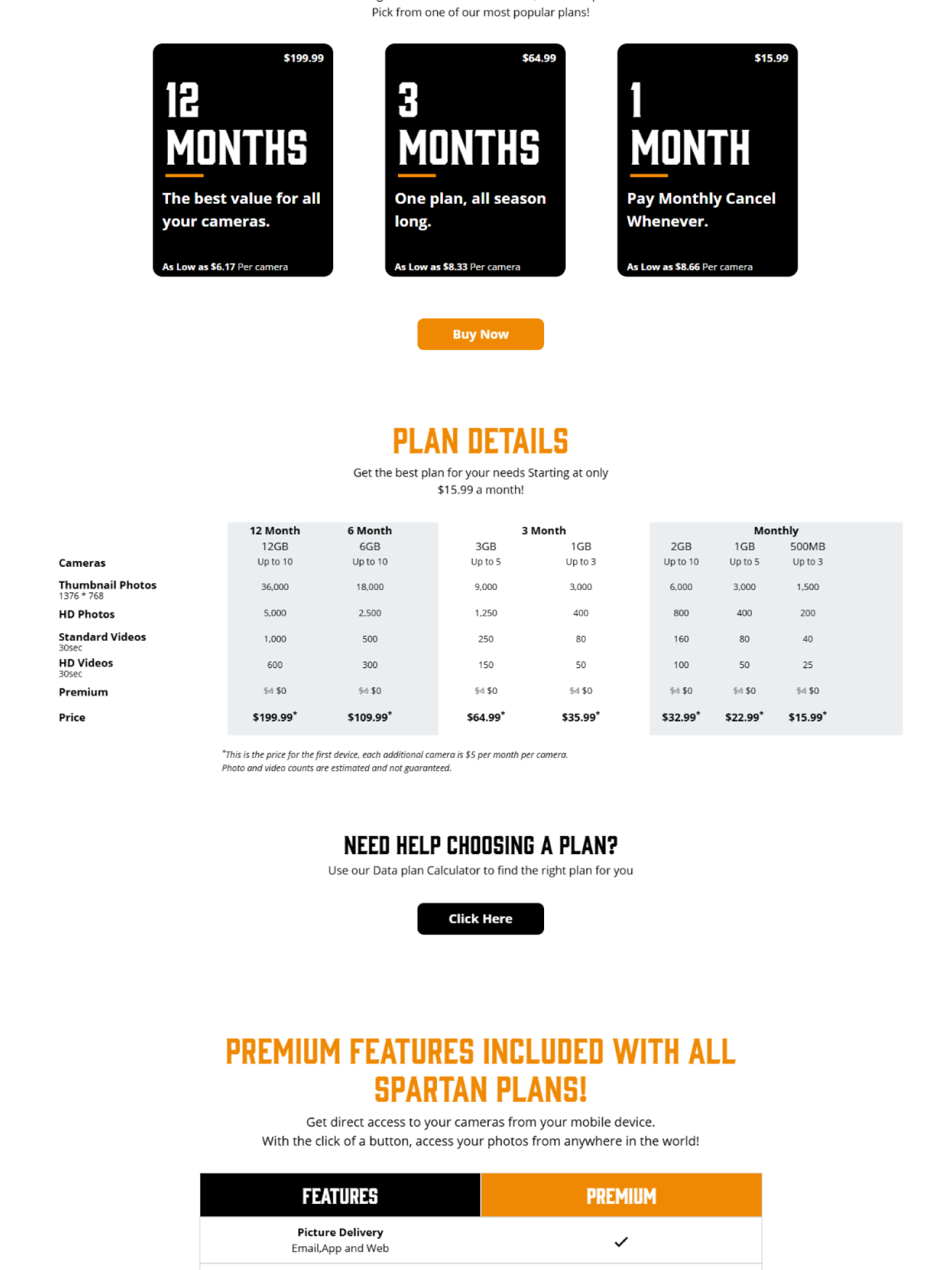
This was probably the most important page in the storefront.
Buying the camera is one thing, but getting that camera connected to the internet with our data plans is what turned it into a real product.
Something our original data plan page was not making easy.
It presented users with a large table of plan types, prices, subscription terms, and shared-data options. Everything was technically there, but understanding what any of it meant required a fair amount of effort.
Someone had apparently decided that putting the entire thing into a table was the simplest solution. or maybe they had just given up...
+++ Solutions +++
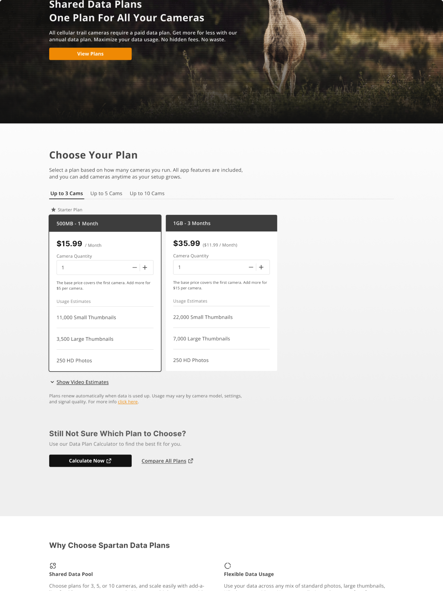
I decided that an entire overhaul of the page was necessary, focusing on the most important thing the user wants to know: "How much am I actually going to pay?".
The new design replaced a never ending table with an interactive plan selector that helped users understand subscription prices, shared plans and monthly billing comparisons
The result was a much more approachable experience for new customers, while still giving experienced users the information they needed to compare plans.
We also received good feedback from our support team who appreciated the honest monthly breakdowns and the shared-data rules explained in a way that didn't require much investigation.
+++ Impact +++
By making the pricing, subscription terms, and shared-data options easier to understand, the new experience gave customers more of the information they needed to make a confident purchase. It was honest.